Showing posts with label Language. Show all posts

Wednesday, 22 May 2019

model answers

Explain how viewpoints and ideologies are communicated by the language used in adverts. Refer to Source C (Old spice ad) to support your answer.
 
Old Spice has been known for its strange, random advertisements in order to show its products. Within the ad for the Bahamas scent, the ad includes the brand's front man Iasiah Mustafa, an ex NFL American footballer. This has been done as he is a representation of manliness, strength and attractiveness. The brand aims to attract both men and women with women being targeted to buy for their man and men targeted to in order to look like the star. Women are targeted through the man's flirty eye contact giving them a direct mode of address connoting confidence. This would attract women to buy for their men so that they could be like him. Similarly men would want to buy the product as they feel it would make them look like him. 

The advertisement has a heavy consistent theme of paradise. The ad shows an exotic tropical beach filled with many people having fun. The idyllic scene would attract customers as they would want to be there and have pleasure in wearing the product. The high key lighting of the image connotes a hot and sunny scene. 

This advertisement shows that many adverts rely on attracting their audience by showing them what could happen if they wear the product such as becoming attractive. The advert relies on the ideology of patriarchy in order to draw in women who would stereotypically be attracted to Mustafa as he is a representation of the ideal man. 

The advert contains ideas of being fresh and new. For example, within the background of the beach there is a chaotic scene of a nautical ship being sunken. This could signify a reference to their previous unsuccessful branding which targeted older, richer men. By showing the ship sinking, it could connote ideas of getting rid of the old and bringing in the new - the Bahamas scent. This shows how adverts like to draw in audiences by showing that they have the newest brand and have more to offer than other brands. 

Old Spice differs from other brands in the fact it uses overt persuasive techniques through the use of humour. Within the tag line, it says a statement followed by 'This fact has not been fact-checked.' This would attract audiences as they aren't presented as serious or openly trying to persuade them but are informal and fun. This is further signified by the absurd use of the image which is random that no other company has been seen to do. This could be to make the audience remember the advertisement, therefore are more likely to buy the brand or this could be part of their USP as their advertisements are different and one of a kind.

Music video 10/10-
 Explain how representations in music videos are chosen to promote the artist(s). Refer to one of the music videos you have studied to support your answer.

The purpose of music videos is to promote the artist to their audience. The representation of Corrine Bailey Rae (CBR) in her music video Stop Where You Are associates her with the idea of transcending prejudice and inequality. In the video the artist is seen to transcend prejudice. This is achieved by placing the artist in an urban environment encountering young characters who are stereotypically on the edge of society. We see the artist interact with these characters at different points in the video. For example, she goes up to the lonely girl and touches her shoulder as she walks past; she stops the girl gang from fighting by holding up her hands with the lyrics ‘stop where you are’ and she dances with the black youths at the end of the music video. The use of constructing two sides to the characters’ representation, firstly as a threat and then as people with qualities and skills, helps to reinforce that young people are approachable and valuable and that the artist not only believes this but can make the lives of these people better. These representations would appeal to the target audience either through identification with the characters, their age or cultural diversity, or the idea that the artist accepts them all regardless of social stereotyping. The representation of the artist through the production values used in the music video is another way in which the representations of CBR can be seen to appeal to her target audience. Although the video has a social realist, urban theme, the production values are artistic and the way the urban environment, the artist and the characters are represented is stylized. This suggests that the artist is concerned with urban and social commentary but is artistic and stylish regardless. This representation is achieved in a number of ways. The introduction of the artist is very conventional fading her in from a black screen, cutting to her face, her legs and back to her face when singing. The cross cutting of these shots of the artist with the urban location using low angle shots to reinforce the extreme angles of the building with glimpses of the blue sky above creates a meaningful connection between the artist and her environment and suggests that it is one that she, and her target audience, can transcend. The framing of the stairwells and corridors serves to create a sense of entrapment for the characters, especially when contrasted with the placement of the artist with the characters in more open spaces in the choruses and towards the end of the music video. A further way in which the artist is promoted to her target audience is by the use of costume. The red dress is a powerful symbol in the music video. 


BIG ISSUE question (Abba cover) 13/15

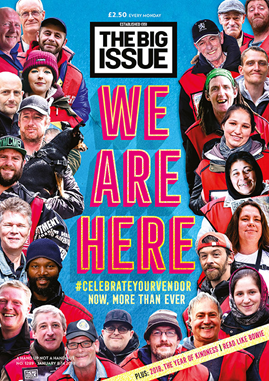
Analyse why The Big Issue magazine has used an intertextual approach to the referendum on its front cover. In your answer you must:
 • Analyse the use of intertextuality to create meaning in the source
 • Make judgements and reach a conclusion about the advantages of this use of intertextuality to The Big Issue magazine.  

The Big Issue magazine prides itself as niche and providing a critical view that is outside mainstream journalism. Intertextuality refers to the process of creating references to any kind of media text through another text. The intertextual reference to 70s pop band Abba and their song Winner Takes It All to represent the referendum is to reflect the status and identity of the magazine, to appeal to the target audience and to give additional meaning to the referendum vote. One reason why The Big Issue magazine has used an intertextual approach could be to identify the magazine as niche and outside mainstream reporting. The use of the intertextual reference to Abba presents The Big Issue as a magazine that looks at events critically and would likely contrast with reports on the referendum found in newspapers or more mainstream magazines. This approach to reporting the referendum highlights that The Big Issue can be relied on to offer fresh perspectives on current affairs. The representation of the politicians as pop musicians also helps to position the magazine as informal and witty. The use of intertextuality through inclusion of the song’s lyrics is a further way in which the magazine has adopted a witty approach to the event. The lyrics have been adapted to reinforce the viewpoint each politician on the referendum. This shows that the magazine is confident that the lyrics have cultural significance and are well known by its readers. They are also assuming their target audience will have a good grasp of current affairs and will appreciate the personalised link between lyrics and politician. An intertextual approach through the use of text is further achieved with the issue’s headline: Winner Takes It All. This is used to develop the Abba reference and the band’s song but, in terms of the political context, it is also highlighting that the result of the referendum will only have one outcome and it will be significant for whichever side wins the vote. By using the intertextual approach with Abba in this way, The Big Issue has cleverly managed to satirize the event and the politicians involved, yet remain impartial politically. This helps the magazine to take a more neutral position on the referendum and offers balance for their target audience. This is important because, as a charity, The Big Issue wouldn’t want to alienate readers for fear of disadvantaging the street vendors who sell the magazine. From this front cover, it is evident that the intertextual approach helps to identify The Big Issue as a provocative magazine that provides independent journalism and in doing so, is able to challenge people’s perceptions. A further reason why intertextuality has been used by The Big Issue magazine is to address and appeal to their target audience. The magazine’s audience is 72% ABC1 and 43% AB. This indicates their target audience are likely to be educated professionals and a sophisticated audience who will understand the intertextual reference to Abba, the personalisation of the lyrics and the satire they offer of the issues about the referendum. Through using this intertextual approach, the magazine addresses an aware audience and the references to Abba indicate the audience will enjoy recognising cultural references and satirical representations of current affairs and international politics. A final reason why The Big Issue may have used an intertextual approach on their front cover is to represent the referendum from a particular point of view and in an engaging way. In order to represent their story about the referendum vote, the magazine has placed the heads of the four politicians onto the bodies of Abba’s band members. The use of this intertextual reference, and the construction of the politicians as band members is very humorous. The heads of the politicians, the facial expressions they are making and their body language, through the performance of the original members, fit but look odd. The oversized heads on smaller bodies make the politicians look like puppets and foolish, indicating that the magazine doesn’t hold them in very high regard. It could also suggest that through using the intertextual reference to Abba, by presenting the politicians as a pop group performing on stage, it works as a metaphor to highlight the performance of the politicians courting popularity for their views on Leave or Remain. Through using this intertextual reference, The Big Issue is continuing the history of satirical cartoons that combine political images with popular culture which helps us to see the referendum in a new way, and leads us to question the motives of the politicians involved. Therefore, there are a number of reasons why The Big Issue magazine has used an intertextual approach to the referendum on its front cover. The identity of the magazine as intelligent, witty and both politically and culturally relevant is expressed through this approach and helps the magazine appeal to its educated and intelligent audience, whilst taking a satirical approach to the politicians involved in the referendum.

Friday, 26 April 2019

Titanium music video


  ・2011- written by Sia, David Guetta, Giorgio Tuinfort and Afro jack
music video release- 11th December 2011

・Genre- house and urban dance 
supernatural scene and suburban setting for the recall of the science fiction film 'super 8' in which Lee (boy in video) stars in.

・The songs lyrics are about inner strength focusing on a young boy with supernatural powers. 
Filmed in Canada- school in Quebec.

meaning of lyrics-
- inner strength 
-not being knocked down
-always getting up again

themes- 
- supernatural
-special powers
-puberty affecting body and mind
-inner strength
-standing up for what is right/ believe in
-adults v children

distinct
Describe in detail, setting, theme,icons, narrative, characters, textual analysis 

D • innocent boy juxtaposes his character in he video as he is seen as danger
• character has uncontrollable power 
S • abandoned school , North American Suburban , autumn, his house empty, messy, no parental figure,woods, sun setting , dusk- shows time passing- to evening 
T • supernatural,inner strength, fear, bravery, adults v children, panic, violence, unexplained explosion, fiction v reality
I • toys, keys, bike, gun, paper, television, torches, floating teddy bears, hat, gloves, bag
N • a young brave child who has uncontrollable powers, he probably caused some chaos at school, cycles home, packs his bag to run away, being chased knock on door, gets his superpower to get keys, floating teddy bears, knock down the door, runs back out, through forest,chase, crawls, hand on head as surrendering and filled with fear, superpower cause police to bounce back
C • boy (protagonist, leads the narrative), teacher ( on phone in school panicking), sheriff at school, police officers, two jogging ladies.
TA•-

F- camera shakes when boy is on the bike to reinforce the amount of power he has.
A- level with boy sat on the floor, medium close- upshot -how normal he is, juxtaposing with his super powers. Long shot,tracking backwards to show the setting of the school. 
M- slow motion of teacher running, enhances her fear. Fast pace when boy is on the bike, shows his powers. 

C- normal, everyday clothing- Boys clothes look a bit ragged and worn. 
L- daylight, until end of video when it changes from dusk to dark. 
A- young innocent boy 
M- none
P- guns, gloves, hat, bike, bag, torches
S- suburban place in America.

Intertextuality- superargo film, relates to the boy in video.

Music Video-

G- genre
I-  instruments
L- lyrics
E- emotion

3rd Viewing-

 editing; Screen-time, transitions, order of narrative, pace, special effects
 Sound; genre, instruments, lyrics, emotion

S- little boy has most time 
T-  straight cuts, passing of time- dusk to evening 
O- Time order 
P- slow motion whilst in school parallel to slow pace of music, fast pace when beat drops- boy is on the bike- illustrating his powers. 
S-  teddies flying around, explosion and using his powers to bring keys to him. 

G- dance/pop 
I- 
L-
E-


Thursday, 25 April 2019

stop where you are

CBR- Stop where you are

 Stop where you are- April 2016

Genre- Hybrid soul/pop- strong British vibe


Most of her work has been influenced from her husband passing.

'Stop Where You Are' is about being present, stopping and celebrate what's happening right at this very moment.

DRCAGES

Disability
Regionalism - rough area of London,
Culture-
Age - teens- 30
Gender - Both, unsure of gender at first due to rough clothes- i.e. girls wearing boyish clothes
Ethnicity-  all
Sexuality -

The Artist- share the message of equality
The setting- rough, estate flats
The Themes- spread love, treat everyone equally, stereotype , not judging people, living in the moment, seize the day
Intertextuality - none c

F- 
A- Low angle looking up at her- light through her hair , high angle- medium shot -man in suit giving her coffee- contrast with woman who is scary looking, man giving her a second chance, low angle showing the setting
M- waking slow,  slow motion , slow motion whilst dancing/ back flip


C- artist wearing red to stand out, everyone else wearing dark colour 

L- 
A-
M- man wearing makeup, looks quite feminine  
P-
S-

* either conform and subvert to stereotype

・teenagers are represented as lonely/ misunderstood figures.
・ the framing of the girl 20 secs in
・wide angle shot enhances the smallness of the teenager


Tuesday, 23 April 2019

this is america analysis

* camera- FAM
* mise en scene- CLAMPS

contrapuntal


1.       How is this video commenting on historical, social, cultural and political issues? 
The video comments on political issues as it represents shootings that occur in America frequently. The actor does  popular dance moves, despite all bad things going on in background, implying how America deal with their problems- by not caring and pretending like its not going on. 
Shocked, disgusted and outraged by the historical and contemporary persecution of black people in america. 
 There is mesmerising tension between the images and the juxtaposition between the dancing and violence, Its postmodernism as it employs of the hip hop genre but uses juxtaposition due to glovers dancing throughout. 

2.       What is the role of Glover in the video?
He portrays how American media is shown throughout and how easy It is to get a gun and shoot people.  He walks around casually and carries narrative, whilst setting a  good example to young children- influencing them what is good and bad.i.e. showing them dance moves.  
Glover shows how it is the country itself doing the killing so he continues to smile and dance and not paying attention, just like America is doing. 
He is seeking social change, and proving that black lives matter. 

3.       How does this promote him as an artist?
Seeks social change and values equality, therefore promotes him as an artist due to him using his status and platform in the media, to make a change and set an example. 

4.       In the opening scenes Glover uses grotesque smiles and exaggerated poses, why?
Jim Crow was a character created by a White man - played by a white person in black face, designed to mock black people and segregate them.
 Glover is commenting on racism In that era 'minstrel'- grotesque and cartoonish way black people were portrayed, trying to show how black people were portrayed in society once. 

5.       Guns vs black lives – what representation is constructed here?
There was two shootings not long after each-other which shows how frequent it is happening in America. One was more of a terrorist attack with gospel choir and the other was more of a gang violence related, illustrating how there are many different types of violence and massacres that happen. 
Guns are  treated with more respect than black lives in the video as the gun used to shoot a random person was carried off carefully by nice dressed man, whereas the corpse was dragged off and immediately disregarded- reinforced by framing of the scene.  

6.       What is the significance of the choir?
Representing the religious aspect of it all, due to it being a problem in America, causing wars and terrorist attacks etc. The shooting represents religions breaking  apart. 
It was a reference to the 2015 Charleston massacre  in which white supremacist opened fire in black church. 
There is polysemic(multiple meanings) he's tired of pressure to accumulate wealth. 

7.       Camera pan to black men on mobiles? What is the significance of this?
Instead of helping what's going on they film it- represents todays society with the media and teenagers so involved in technology and social media, they are oblivious to what's going on around them, so they can't make a change. 
It also refers to the case of Stephen clark who was shot dead a few weeks before the music video was released, who police assumed was armed but only had an iPhone on him.  

8.       Why the white horse in the background of the frame?
 Bible reference - appears in corner of the frame, unbeknownst to Gambino and his dancers. 
White represents innocence and purity, which juxtaposes what's going on in the frame around it. 

9.       Juxtaposition of dancing and violence, why?
 Dancing whilst riot ensues in background of frame, could be read as America avoiding the problems that occur. Also represents black culture as they are known for always dancing and having a good time, commemorating the lyrics 'we just want to party' , showing they don't want any violence or harm. Usage of entertainment as a literal and figurative distraction to the chaotic background. 
With the lyrics 'shake the frame'- distorts and blurs what's really going on i.e. the violence in the frame.

10.   What do the empty cars and burning police car signify?
Riots, violence, lack of police support. Number of black men killed during traffic spot.
Could also represent stolen cars as they are flashing in the frame- playing on the black stereotype that people may have in America, based on old fashioned views. 

11.   What is the significance of 17 seconds of silence?
Direct reference to the 17 students that died in parkland school in america- showing respect to them.
12.   What is the intertextual reference in the closing scene?
'Get Out' reference- as they are running away. 
Camera
Frame-  frame shifts all the time- long shots showing chaotic background as well as Glover dancing to distract. 
Angle- front view, zooming in and out of Glover dancing- showing full setting 
Movement- slowly moving closer to gutter on chair, 17 second silence, relates to children who was killed in shooting. 

Mise En Scene
costume- chain and trousers, 70's related
lighting- hard lighting throughout, until end when its low lighting
actors- topless, children in school uniform, stereotypes of black people 
makeup- simplistic- very little
props- masks, lots of cars, guns 
setting- basement setting, rough and run down 

Conventions of a music video-
* videos are used to promote artists- their music and fan base. This increases sales and their individual profile.
* can usually show development of the artist
* artists are given most screen time.
* a performance element of the video needs to be present, as well as a storyline. 


Thursday, 28 March 2019

old spice


Lucozade

Old Spice

- Founded in the 1940's.
- product that children would buy for their fathers- good gift for people.
- firstly introduced for women- 1937
- introduced for men- 1938
- 2012- iconic clipper ship logo replaced with a yacht and targeting changed to young demographic segment. 

The old spice campaign 2010- 'THE MAN YOUR MAN COULD SMELL LIKE'

- was becoming outdated and for old men.
- set on Wieden + Kennedy to re market. 
- direct competition with 'Dove' Super Bowl campaign in 2010. 
- Proctor and Gamble's research showed that 60% of mens body washes were by women so old spice needed to attract female shoppers. 
- Many products on the market lacked masculine credibility so old spice could work on the idea of smelling like a man. 

Target audience- 12-34 men and their women shoppers. 
old spice media strategy for the launch was simple; instead of spending money on the Super Bowl, they aimed to create Super Bowl impact building awareness around it. 

・1ST communication layer- (SEEDING)- start building buzz with old spice fans 'the man your man could smell like'. 

・2nd communication (LAUNCH)- next, search engines strategy played a key roles people thought that super bowl had launched it just because they did it all round super bowl.

・3rd communication (ENGAGE)-  post launch, old spice media strategy addressed one of the key ingredients for success, getting both sexes to talk about the campaign. 

Youtube- 10 million views
Facebook- 55000 fans
old spice.com- traffic increased 9 times. 

social anxieties- 
- the athletic and muscular bodies represent the male obsession with  their body image thus attributing a certain body insecurity to the target audience.

inequalities (race)- 
- black look by bell hooks hyper- sexuality of black bodies over white.
(sexuality)
- importance of heterosexuality in constructing masculinity to sell the product to women.
(gender)
-reinforcing a patriarchal society, a man who uses old spice will take the female viewer away, she cannot take herself. 


Wednesday, 27 March 2019

lucozade

Lucozade-

* Created 1927 as Glucozade- meant to give energy to the sick 
* Renamed Lucozade in 1929
* 1983- rebranded as sports drink and not a health drink.

Campaign-

£4 million campaign
GlaxoSmithKline consumer healthcare- owners of Lucozade In Jan 2013
Lucozade sold to Suntory in sept 2013 for £1.35b
Ad stars- Gareth Bale (spurs) and Alex Oxlade Chamberlain (Arsenal)
Campaign banned in Jan 2014 by ASA as it failed to show that it only had benefit during prolonged exercise. 
cultural context-

・Consumerism- The total value of the of the soft drinks market in the United Kingdom  is around £15 billion
Gareth Bale use of celebrity, representation if man 'new man'
・Celebrity culture- Capitalising a star appeal/ star as commodity. 


Lucozade Advert- 

'scientifically proven'- explaining the better results you will have from the drink
・Target audience is sports people-anyone wanting to be fit and have attracted the audience due to well known sports star 'Gareth Bale'. 

・Masculine, focus, strength, determination, 
・Human need- happy, energetic, performance increase, success.
Do you believe? Yes,  and Scientifically proven- much better than water, brainwashing audience.  


・The colour scheme of the advert is mainly blue and yellow with parts of black and white. The blue and yellow are the exact same shades used on the packaging of the product which make it explicitly clear that the product on sale is Lucozade Sport. The blue colour scheme is also carried over onto Gareth's eyes, the blueness of his eyes appears enhanced to match the background of the advert. 

・ The play on words ' in a different league' could reference a football club, but also that the drink is better than the others because it is 'in a different league'. 
・ Lucozade sport is targeted at people who do sport, as suggested by the name and the use of a famous sportsman (Gareth Bale) is a footballer it may be more specifically targeted at footballers as well as the general sporting community. 
・At the top right of the page the advert references the company that Lucozade is owned by : GlaxoSmithKine. 


Sunday, 24 March 2019

the big issue essay


Explain how the representations in magazines reflect their contexts. Refer to The Big Issue covers you have studied to support your answer. [10]


The front cover of magazines are adverts  for the magazine, so in the same way as with advertising they tend to reflect the influence of consumerism. This is particularly visible in lifestyle magazines, where descriptions of lifestyles reflect our consumer society ideals of a 'good life'. Magazines such as Cosmopolitan, for example will often offer advice on how to improve you appearance, life style and diet etc.  However, in contrast to this The Big Issue magazine is designed to help homeless people and and have a more political, more altruistic focus.
An example of this is 'The Big Issue's' front cover of Harry and Megan's royal wedding with a headline 'Celebrate Big Issue style', suggesting that 'The big issue'  are  celebrating the wedding, so they are influencing everyone to celebrate with them. The message being presented is that there is a lot of support around the big issue, this is shown through the famous figures having the big issue vests on, making the audience know that everyone helps. There is a lot of social context, trying to show that 2 completely different classes are and should be equal in society. They use their constant reinforcing message ‘a hand up not a hand out’ as well. They show it on a big flag to portray that everyone can see it and that it is significant.
The clothes that are worn in both covers include the red vests which are worn when the homeless are selling the magazines. This makes the different classes of society mix into one, ignoring all the other factors. It presents the people to be equal no matter their status.
The amount of people in the 'We are here' cover, highlights that there are many homeless people handing out the magazines and making a difference in society. 
In 'The Royal Wedding' front cover the Harry and Megan are cartoons and so is the background, however in the 'we are here' cover, all of the pictures are real life images. This gives a sentimental feeling of the magazine, knowing that the people on the magazine's lives have been helped from the big issue, however due to the other cover being in cartoon, it indicates that they are more blurred to the realness of the big issue as they haven't been affected in that way.
Furthermore, in the 'We are here' front cover the images are all the homeless people who sell the magazine. The pictures are very inspiring and complements the title, as it indicates how they are there and trying to encourage people to make a change like the others have. These images would make the readers warm to the magazine as a majority of the people are smiling, representing how much the big issue has helped them.
The colour scheme of the front cover is blue and red, with having red typography which combines well with the red vests in the images. The colour red represents many things as it is an emotionally intense colour meaning, love, strength, passion etc. The blue is used as a background as it is a neutral colour, explaining how the magazine is gender neutral.
Finally, the anchorage text 'we are here' spreads the message about how there is always someone available to help and that nobody is alone, which also complements the photos of the homeless who have experienced the help the big issue give. 


Wednesday, 20 March 2019

big issue terms


masthead-  title of magazine (big issue)

Plug-  text that 'plugs' a feature that will appear inside the magazine

Puff-  story given prominence on the cover 

Cover star-  the 'star' featured on cover.

Anchorage text -  text that anchors main image and gives it context/ meaning.


Banner-  text that runs across lower section of cover

Skyline-  text that runs across the top of the story.

 > 70% of money comes from advertising. Magazines with small circulation- more dependent on advertising than one with a large circulation.

> 100,000 copies of big issue sold each week

> venders buy copies for £1.25 and sell for £2.50

> more than 5,000 people in Britain.

> from 2016- 200 million sales on big issue


Big Issue


・political, social and cultural context.
・Niche magazine outside the commercial mainstream.


C lift                 C ostumes                    F rame
L ayout                L ocation/ lighting          A ngle
I mage                 A ctors                      M ovement
F ont                  M akeup 
T ypography            P rops
                       S etting


Key Terms:

Circulation-    number of copies a magazines sells 

Readership-  not just who buys a magazine but the total number of people likely to read it. 

Mass Audience-   readership on a very large scale.

Niche Audience-  narrow group of readers with a particular interest.

Subscription-   where a reader pays for a set number of copies of a magazine in advance at a lower price and receives them by post.

Intertextuality-  Big issue- one media text with early men- another media text. 


Wednesday, 21 November 2018

Representation in Newspapers


i front page

The Daily Telegraph and The Independents comparison of articles:


Daily Telegraph front page           


The main image in The Daily Telegraph is the Royal Family celebrating Charles 70th birthday- however the Independents main image is of Theresa May, due to the events of Brexit that occurred on this date. 
The Independent doesn't have anything to do with the Royal Family on there front cover, although it is The Daily Telegraph's main story.
This is due to The Daily Telegraph being royalists and support right wing, however, the Independent are left wing and do not have any interest in the Royal Family news stories.


Thursday, 15 November 2018

Advantages and Disadvantages

Advantages of Online Newspapers-

> Environmentally friendly

> Live updates (latest)
> Your own personal account to choose topics- Personalising it
> Accessibility- phones, tablets; more practical.
> Free (paywalls- daily telegraph, The Times), Guardian success story asks for subscribers.
> Contact papers quickly.
> Comments on news stories- audience participation
> More interactive- videos and adverts.
> Easy to share articles


Disadvantages of Online Newspapers-

> Holding something- phones, tablet e.t.c 
> Internet needed
> Cant keep the article/ story
> Less accessible for older generations
> Less information 
> Technical errors
> Pop up's- adverts
> Eye strain
> More distracting


Tuesday, 13 November 2018

The Daily Mail and The Guardian

The Daily Mail


The Daily Mail presents their page with bold shades of colours, instantly drawing the readers attention onto there page and reading their stories. Along the top of the article they present the weather forecast, date and time - showing that it has live updates with frequent information. 
Underneath the masthead there are many subheadings, including; Sport, TV and showbiz, Health, Science, Travel e.t.c.  I clicked on 'News' so it then came up with topics related to news currently, for example; Royal Family, World news, Arts e.t.c
This is convenient as it takes you directly to what you want to see and are specifically interested in , so its useful and quick for the reader. 
Beneath that is an advertisement for their @mailonline twitter page, the ad is much bigger than the masthead and title, therefore is certain to be seen by readers. Along the side of the page, however much smaller are their accounts for Facebook, Instagram, Pinterest, and Snapchat- so readers are aware that you can access the news on every social media platform and not just their main website. 

The main story itself, is quite terrifying and disturbing; the skyline states 'Terrifying moment gang corner their victim and slash him with huge 3.5 ft long MACHETES as they dish out vicious beating on residential street in Birmingham'. The bold text instantly grabs the readers attention, as well as the detailed explanation of what happend with the violent and aggressive vocabulary, such as 'slash' and 'beating'. These words portray a negative image immediately for the reader about the article and indicates that it isn't going to be an enjoyable read.
Underneath the skyline, there are three sentences to summarise what actually happened, who was involved and where it happened. 
The byline confirms who wrote the article, when it was published and last updated, it also gives you a number or how many people have shared the article already, which for this one was 3.7k.  

Further down into the article, there is a video of the violent crime taking place, to give readers a visual representation of what happened. There is also the body text which explains what happened to the boy as well as a pull quote taken from a pedestrian near by to the incident. It shows a few main images of the gang with the machete, and then a picture of the actual weapons used in the crime- all with captions under them to outline and explain the images further. 

After the images, there is a chart to show the figures of police recorded crime and what percentage of these were Murders, Robberies, knife crime e.t.c.
Afterwards, there is as section about one of the victims, who is a 16 year old boy, there is a picture of him in a suit, looking innocent and young- which readers would sympathise whilst reading. 
It them states how the Metropolitan police are finding it harder to work with house office rules, so they want to reinforce rules. 

Throughout the article, there are separate stories along the right hand column- mostly celebrity gossip. In this article there are 63 different side stories that you can then go onto looking at. Some of the examples on this article are to do with Im a Celebrity get me out of here, science of beauty, and  articles on different celebrities including, Vicky Pattison, Scarlett Moffat, Cara Delevingne and Paris Hilton. 


The Guardian 


The Guardian is a newspaper known as a broadsheet and presents their articles in a more formal and sophisticated manor- due to not having any big bold writing and simple colours. At the top of the article is the masthead 'The Guardian' in a simple white font, which is surrounded by different links , including a search button, a job search and sign in- which would be useful for people who are only interested in specific news.
The main subheadings are at the top of the page, they are named; News, Opinion, Sport, Culture, and Lifestyle- these take you onto the specific type of information that you want to see and read.
The skyline states 'Westminster council to ban supersize new homes', this is very different to the daily mails skyline, due to it being very simplistic and to the point- not very detailed and quite subtle (not bold and large writing).
The main image is very picturesque but simple, with a caption underneath stating where the location is and how much it is worth. 
The main story is about the council setting a 150 square meter limit on housing- so they can build more affordable houses and that they will build 10,000 affordable units by 2040 with all the freed up space. 
Further into the article, there is mention of the statistics of the average sized UK house and that the supersize house are 50 % bigger than this. There is a pull quote  in the article from Richard Beddoe, who is involved with the council, he states that 'We want Westminster to be home to thriving , mixed communities, not empty super-prime properties. That's why we will be restricting the size of new luxury apartments and introducing a new extra bedroom policy to make it easier for families to extend their homes so they have enough space to stay living in Westminster and are not forced to move out" 


Thursday, 8 November 2018

Newspaper Terminology


Newspaper Terminology-

> MastHead -  Title of the newspaper displayed on the front page.

> Barcode-  Used to scan the newspaper when purchasing it is an optical, machine- readable, representation of data contains information such as price. 

> Caption-  Brief text underneath an image describing the photograph or graphic. 

> HeadLine-  A phrase that summarises the main point of the article. Usually in large print and a different style to catch the attention of the reader. 

> Main Image-  Dominant picture, often filling of the front cover. 

> Page Numbers-  A system of organisation within the magazine. Helps you find what you want to read. 

> Target Audience-   People who the newspaper aims to sell to.

> Pull Quote-  Something taken from within an article, usually said by the person in the main image. 

> Classified Ad-  An advertisement that uses only text, as opposed to a display ad, which also incorporates graphics. 

> Skyline-   An information panel on the front page that tells the reader about other stories in the paper to tempt them inside. 

> Edition-  Some newspapers print several of these every night, these are versions with some changes and maybe additional late stories.

> Stand First-  Block of text that introduces the story, normally in a different style to the body text and headline.

>Byline-  The line above the story, which gives the author's name and sometimes their job and location.

> Body Text-  Also known as copy. Written material that makes up the main part of an article.

> Standalone-  Picture story that can exist on its own or on a front page leading to a story inside. 

> Centre Spread-  A photograph, often in full colour, that runs across the middle two pages.

> Lead Story-  Main story, usually a splash.

> Cutter-  The blank space between margins of facing pages of a publication or the blank space between columns of text. 

> Folio-  Top label for the whole page. Can relate to the area covered in the paper, for example, National or big news topics such as Social Media, Syria.

> Page Furniture-  Everything on a page expect pictures or text of stories. 

Tabloid and Broadsheet

Tabloid - 

For example:Daily Mirror, The Sun, Daily Mail. 


> Images (lots of them)

> One main headline- usually large, catchy, rhyme, abbreviation, alliteration, even invented spellings. 

                         ↗
> Pun titles/ exaggerated 


> Brief summary of story

> Gossip, celebrity based freebies 

> Less formal 

> Less informative(not so in depth)

> Subject matter of articles- not really news

> Colourful 

> Big font sizes


Broadsheet-

For example:The Guardian, The Daily Telegraph

> More information /more articles (bigger price)


> One main image- Ratio , 75% text ; 25% image

> Bigger size generally (smarter, well informed, more info)

> Subheading for other stories 

> Titles- Times/ telegraph, authority/ wisdom guardian 

> More trustworthy, informative news stories.