Showing posts with label advertisement. Show all posts
Showing posts with label advertisement. Show all posts
Monday, 22 April 2019
Friday, 12 April 2019
essay
Analyse how social and cultural contexts can influence advertising.
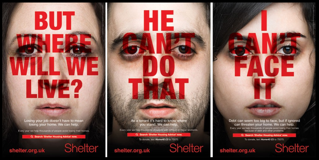
Shelter is a charity that helps people specifically with bad housing, homelessness or people face the threat of losing their house by the government that need advice and practical assistance, and fights for better investment in housing and for laws and policies.
The shelter campaign advert consists of three close- up shots of faces with a blank and bland expressions. The pale plain faces connotes that the people may be feeling weak and vulnerable however the Shelter charity can help vigorously reverse this. There is a lack of diversity both socially and culturally, and the advert as a whole shows a lack of culturalization. As a result of this, it enables people to view homelessness from a different perspective because of the usual stereotype of them being viewed as normally dirty and scruffy. The three people In the advert are normal and white , therefore going against the cliche.
The campaign helped people to realise that homelessness could happen to any normal person and to spread the awareness of how common it is nowadays.
The actors used in the advert are adults which makes it more realistic and gives an emotional attachment, as it is possible that is happening to them so makes it more relatable to the public.
The colour scheme of them adverts are very standard, due to the red, white and black which all complement each other. The simplicity of the colours mean that the message of the advert is carried across easier than it would be if there was more complex colour combinations. This idea could also highlight how it isn't a complex process to get advice from shelter but instead it is very simple and easy so people should do it before they into a bad housing situation. The use of the red connotes a sense of seriousness about the issue and that homelessness isn't a joke to to be taken lightly.
Each poster contains a difference scenario that shows how different people can become homeless in different situations. This is used to inform people that anyone is vulnerable but it can potentially happen in anyway! This creates links to social context of the audience of the luxury's they enjoy everyday however those in need don't even have a roof over the head again adding to the sympathy.
shelter campaign
Advert analysis
Each of the posters contains a different scenario that shows different ways people can have housing problems and face homelessness. This is employed to inform people that there are a number of ways that cause people to face them in case any happen to them. It creates a sense of realism about the problem and that it is a threat to many people.
The adverts follow the same sentence structure in the bold white writing underneath the mouths of the people. It has a declarative statement followed by the words 'we can help'. This reputation is used to make people in these situations feel reassured because it makes them feel as though the charity is there for them if needed.
The target audience for these posters is likely to be people over the age of about 25. By this time the majority of people would either have an owned property or rent, so these issues would effect them the most.
Tuesday, 2 April 2019
Charity Advertisement
- empathy
- shocking images
 - emotive language
- relatable to public
- slogan
- use of colour/ colour associated with brand
- web adress
- invitation to interact with company/ donate
Shelter Campaign 2011 -
- Founded In 1966 in London
- aims to help people with homelessness and bad housing
- main focus of campaign in poster ads, social media
- poster campaign initially launched in four towns identified as hotspots for housing problems, ran from August 21st for six weeks.
- created by Amplify on a pro bono basis (free)
- some of the slogans are eye-catching 'but where will we live?' - clear message across in direct manner
Thursday, 28 March 2019
Old Spice
- Founded in the 1940's.
 - set on Wieden + Kennedy to re market.
social anxieties-
- the athletic and muscular bodies represent the male obsession with their body image thus attributing a certain body insecurity to the target audience.
inequalities (race)-
- product that children would buy for their fathers- good gift for people.
- firstly introduced for women- 1937
- introduced for men- 1938
- 2012- iconic clipper ship logo replaced with a yacht and targeting changed to young demographic segment.
The old spice campaign 2010- 'THE MAN YOUR MAN COULD SMELL LIKE'
- was becoming outdated and for old men.
 - set on Wieden + Kennedy to re market.
- direct competition with 'Dove' Super Bowl campaign in 2010.
- Proctor and Gamble's research showed that 60% of mens body washes were by women so old spice needed to attract female shoppers.
- Many products on the market lacked masculine credibility so old spice could work on the idea of smelling like a man.
Target audience- 12-34 men and their women shoppers.
old spice media strategy for the launch was simple; instead of spending money on the Super Bowl, they aimed to create Super Bowl impact building awareness around it.
・1ST communication layer- (SEEDING)- start building buzz with old spice fans 'the man your man could smell like'.
・2nd communication (LAUNCH)- next, search engines strategy played a key roles people thought that super bowl had launched it just because they did it all round super bowl.
・3rd communication (ENGAGE)- post launch, old spice media strategy addressed one of the key ingredients for success, getting both sexes to talk about the campaign.
Youtube- 10 million views
Facebook- 55000 fans
old spice.com- traffic increased 9 times.
social anxieties-
- the athletic and muscular bodies represent the male obsession with their body image thus attributing a certain body insecurity to the target audience.
inequalities (race)-
- black look by bell hooks hyper- sexuality of black bodies over white.
(sexuality)
- importance of heterosexuality in constructing masculinity to sell the product to women.
(gender)
-reinforcing a patriarchal society, a man who uses old spice will take the female viewer away, she cannot take herself.
(gender)
-reinforcing a patriarchal society, a man who uses old spice will take the female viewer away, she cannot take herself.
Wednesday, 27 March 2019
lucozade
Lucozade-
* Created 1927 as Glucozade- meant to give energy to the sick
* Renamed Lucozade in 1929
* 1983- rebranded as sports drink and not a health drink.
Campaign-
£4 million campaign
GlaxoSmithKline consumer healthcare- owners of Lucozade In Jan 2013
Lucozade sold to Suntory in sept 2013 for £1.35b
Ad stars- Gareth Bale (spurs) and Alex Oxlade Chamberlain (Arsenal)
Campaign banned in Jan 2014 by ASA as it failed to show that it only had benefit during prolonged exercise.
cultural context-
・Consumerism- The total value of the of the soft drinks market in the United Kingdom is around £15 billion
Gareth Bale use of celebrity, representation if man 'new man'
・Celebrity culture- Capitalising a star appeal/ star as commodity.
Lucozade Advert-
・'scientifically proven'- explaining the better results you will have from the drink
・Target audience is sports people-anyone wanting to be fit and have attracted the audience due to well known sports star 'Gareth Bale'.
・Masculine, focus, strength, determination,
・Human need- happy, energetic, performance increase, success.
・Do you believe? Yes, and Scientifically proven- much better than water, brainwashing audience.

・The colour scheme of the advert is mainly blue and yellow with parts of black and white. The blue and yellow are the exact same shades used on the packaging of the product which make it explicitly clear that the product on sale is Lucozade Sport. The blue colour scheme is also carried over onto Gareth's eyes, the blueness of his eyes appears enhanced to match the background of the advert.
・ The play on words ' in a different league' could reference a football club, but also that the drink is better than the others because it is 'in a different league'.
・ Lucozade sport is targeted at people who do sport, as suggested by the name and the use of a famous sportsman (Gareth Bale) is a footballer it may be more specifically targeted at footballers as well as the general sporting community.
・At the top right of the page the advert references the company that Lucozade is owned by : GlaxoSmithKine.
Monday, 25 March 2019
advertisement- paper 1 section b
Three set products, exam requirements-
* Lucozade
* Charity advert (shelter)
What is marketing?
* create awareness of an issue etc
* create interest in the product or issue
* generate desire to buy or use the product
The four p's-
Price, Promotion, Product, Placement
Unique selling point (USP)-
marketing involves identifying the use of the media text.
copy- written explanation of the product. Analysis based on what it says, placement of text, font type and sizes, colour.
Slogan- phrase that describes the benefit of the product the products most important attribute.
logo- a symbol or small design adopted by an organisation to represent the brand.
Analysing an advert?
* aim of print advert
* denotation connotation
* media language- camera shot, mise en scene , typography
* representation of males/ females/ themes/ brand
* psychology- what human needs is it satisfying
Subscribe to:
Posts (Atom)
-
Google Slide- Radio Presentation
-
 Regulation ⇒ ↳ The idea that there is an underlying struggle in recent UK regulation policy, between the needs to further the interes...
 -
DIRT ASSESSMENT 4 - GBHS MEDIA STUDIES A LEVEL Name: Maisie Mark: 3 Date: AO1: Demonstrate knowl...