Explain how the representations in magazines reflect their contexts. Refer to The Big Issue covers you have studied to support your answer. [10]

The front cover of magazines are adverts for the magazine, so in the same way as with advertising they tend to reflect the influence of consumerism. This is particularly visible in lifestyle magazines, where descriptions of lifestyles reflect our consumer society ideals of a 'good life'. Magazines such as Cosmopolitan, for example will often offer advice on how to improve you appearance, life style and diet etc. However, in contrast to this The Big Issue magazine is designed to help homeless people and and have a more political, more altruistic focus.
An example of this is 'The Big Issue's' front cover of Harry and Megan's royal wedding with a headline 'Celebrate Big Issue style', suggesting that 'The big issue' are celebrating the wedding, so they are influencing everyone to celebrate with them. The message being presented is that there is a lot of support around the big issue, this is shown through the famous figures having the big issue vests on, making the audience know that everyone helps. There is a lot of social context, trying to show that 2 completely different classes are and should be equal in society. They use their constant reinforcing message ‘a hand up not a hand out’ as well. They show it on a big flag to portray that everyone can see it and that it is significant.
The clothes that are worn in both covers include the red vests which are worn when the homeless are selling the magazines. This makes the different classes of society mix into one, ignoring all the other factors. It presents the people to be equal no matter their status.
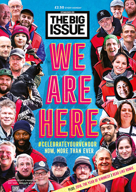
The amount of people in the 'We are here' cover, highlights that there are many homeless people handing out the magazines and making a difference in society.
In 'The Royal Wedding' front cover the Harry and Megan are cartoons and so is the background, however in the 'we are here' cover, all of the pictures are real life images. This gives a sentimental feeling of the magazine, knowing that the people on the magazine's lives have been helped from the big issue, however due to the other cover being in cartoon, it indicates that they are more blurred to the realness of the big issue as they haven't been affected in that way.
Furthermore, in the 'We are here' front cover the images are all the homeless people who sell the magazine. The pictures are very inspiring and complements the title, as it indicates how they are there and trying to encourage people to make a change like the others have. These images would make the readers warm to the magazine as a majority of the people are smiling, representing how much the big issue has helped them.
The colour scheme of the front cover is blue and red, with having red typography which combines well with the red vests in the images. The colour red represents many things as it is an emotionally intense colour meaning, love, strength, passion etc. The blue is used as a background as it is a neutral colour, explaining how the magazine is gender neutral.
Finally, the anchorage text 'we are here' spreads the message about how there is always someone available to help and that nobody is alone, which also complements the photos of the homeless who have experienced the help the big issue give.

No comments:
Post a Comment