Monday, 22 April 2019

Friday, 12 April 2019
essay
Analyse how social and cultural contexts can influence advertising.
Shelter is a charity that helps people specifically with bad housing, homelessness or people face the threat of losing their house by the government that need advice and practical assistance, and fights for better investment in housing and for laws and policies.
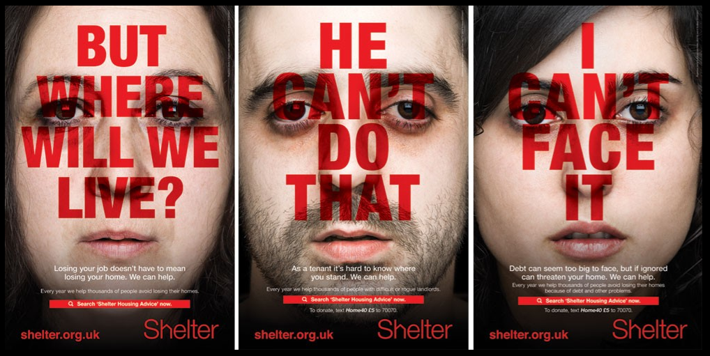
The shelter campaign advert consists of three close- up shots of faces with a blank and bland expressions. The pale plain faces connotes that the people may be feeling weak and vulnerable however the Shelter charity can help vigorously reverse this. There is a lack of diversity both socially and culturally, and the advert as a whole shows a lack of culturalization. As a result of this, it enables people to view homelessness from a different perspective because of the usual stereotype of them being viewed as normally dirty and scruffy. The three people In the advert are normal and white , therefore going against the cliche.
The campaign helped people to realise that homelessness could happen to any normal person and to spread the awareness of how common it is nowadays.
The actors used in the advert are adults which makes it more realistic and gives an emotional attachment, as it is possible that is happening to them so makes it more relatable to the public.
The colour scheme of them adverts are very standard, due to the red, white and black which all complement each other. The simplicity of the colours mean that the message of the advert is carried across easier than it would be if there was more complex colour combinations. This idea could also highlight how it isn't a complex process to get advice from shelter but instead it is very simple and easy so people should do it before they into a bad housing situation. The use of the red connotes a sense of seriousness about the issue and that homelessness isn't a joke to to be taken lightly.
Each poster contains a difference scenario that shows how different people can become homeless in different situations. This is used to inform people that anyone is vulnerable but it can potentially happen in anyway! This creates links to social context of the audience of the luxury's they enjoy everyday however those in need don't even have a roof over the head again adding to the sympathy.
shelter campaign
Advert analysis
Each of the posters contains a different scenario that shows different ways people can have housing problems and face homelessness. This is employed to inform people that there are a number of ways that cause people to face them in case any happen to them. It creates a sense of realism about the problem and that it is a threat to many people.
The adverts follow the same sentence structure in the bold white writing underneath the mouths of the people. It has a declarative statement followed by the words 'we can help'. This reputation is used to make people in these situations feel reassured because it makes them feel as though the charity is there for them if needed.
The target audience for these posters is likely to be people over the age of about 25. By this time the majority of people would either have an owned property or rent, so these issues would effect them the most.
Tuesday, 2 April 2019
Charity Advertisement
- empathy
- shocking images
 - emotive language
- relatable to public
- slogan
- use of colour/ colour associated with brand
- web adress
- invitation to interact with company/ donate
Shelter Campaign 2011 -
- Founded In 1966 in London
- aims to help people with homelessness and bad housing
- main focus of campaign in poster ads, social media
- poster campaign initially launched in four towns identified as hotspots for housing problems, ran from August 21st for six weeks.
- created by Amplify on a pro bono basis (free)
- some of the slogans are eye-catching 'but where will we live?' - clear message across in direct manner
Friday, 29 March 2019
Thursday, 28 March 2019
Subscribe to:
Posts (Atom)
-
・2011- written by Sia, David Guetta, Giorgio Tuinfort and Afro jack music video release- 11th December 2011 ・Genre- house and urban...
-
Target Audience- ⇒ 76% of Guardian Select UK Audience are Progressives , who are affluent forward-looking individuals, curious about the ...

